Final One, I Promise...
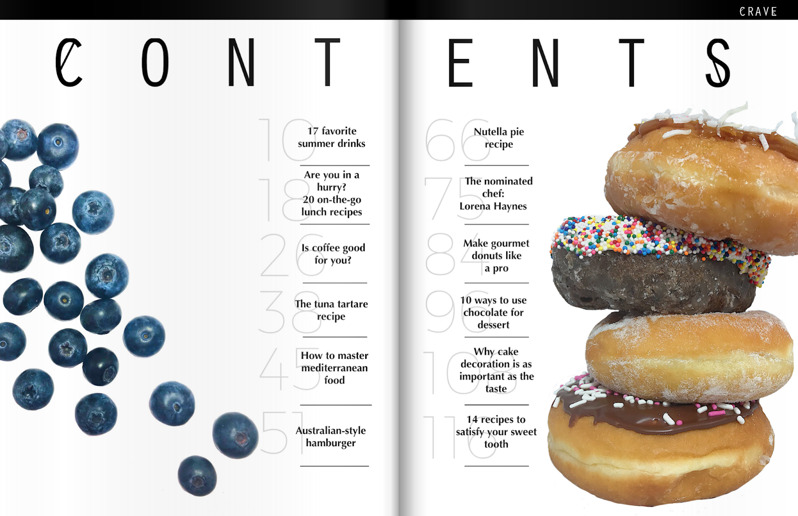
Hey guys! I am really excited to write this post because the second picture below is the complete and final table of contents. As you can see, it is completely different from the last one. I changed it because the last one did not go with the vibe and design of the magazine. This table of contents finally captures what I am going for. It resembles the cover and the whole magazine as a whole. Also, I used a website called Flipsnack, where it converts your pdf file to a flipbook/magazine style. So as you can see, the numbers are not cut off by the middle. The stories and numbers can be seen perfectly and the crease does not conflict with the content in the pages. Lastly, for some reason the website does not show/capture the colors in the numbers. So the second picture is the final one! The colors give the table of contents more color, yet it looks very clean and simple.
Important side note: I am going to create an advertisement. Usually, most food magazines have advertisements and most magazines have advertisements before the reader gets to the table of contents. Therefore, I am going to place the advertisement between the cover and the table of contents. However, since my table of contents go side to side, that means that I have two pages for the ad. So I am thinking of doing an editor's note in the first page and then in the second page an advertisement. We will see how it goes...

Important side note: I am going to create an advertisement. Usually, most food magazines have advertisements and most magazines have advertisements before the reader gets to the table of contents. Therefore, I am going to place the advertisement between the cover and the table of contents. However, since my table of contents go side to side, that means that I have two pages for the ad. So I am thinking of doing an editor's note in the first page and then in the second page an advertisement. We will see how it goes...
Au revoir,
SABRI
Citations:
Generador de flipbooks digitales No.1. (n.d.). Retrieved April 02, 2018, from
https://www.flipsnack.com/es/


Comments
Post a Comment